
Resolution vs Picture Quality
Is higher resolution always better for projected image quality? Not necessarily. This article will guide you in correctly understanding what constitutes high picture quality.
True high picture quality should encompass four fundamental elements: resolution, color, contrast, and gradation. All four are indispensable, and resolution only accounts for a portion of the overall picture quality. Resolution signifies “the number of pixels that compose a frame.” The higher the pixel count, the finer the image detail. In the early days of projectors, when resolution was very low, images appeared blurry and coarse, making it easy to perceive resolution as paramount.
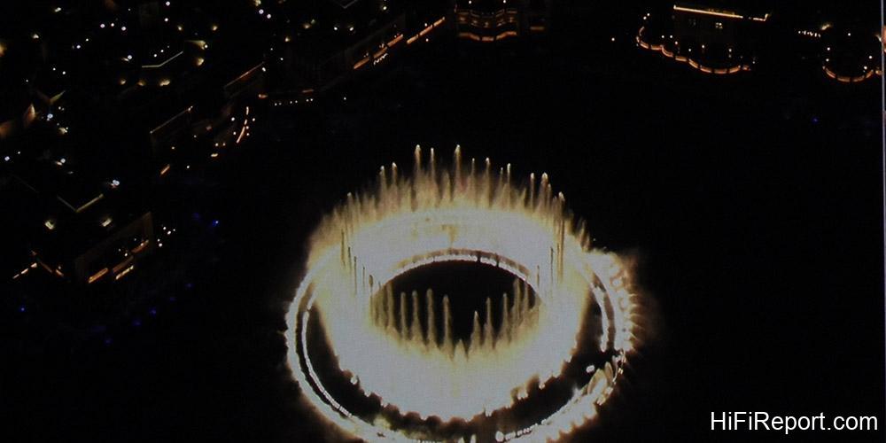
However, once we reached resolutions like Full HD and beyond, which are already considered high, the difference between, say, Full HD and 4K becomes discernible only under specific conditions. This is what we commonly refer to as the “optimal viewing distance.”
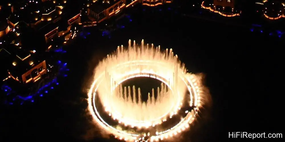
Optimal Viewing Distance
The “optimal viewing distance” refers to “how close you can sit to the screen before you start seeing the pixel structure.” Higher resolution allows you to sit closer to the screen. Experts in Japan have a formula based on the multiple of the screen height. The higher the resolution, the shorter the optimal viewing distance. For 4K images, the optimal distance is approximately 1.5 times the screen height.

For a 100-inch 16:9 screen, the height is about 1.25 meters, which translates to an optimal viewing distance of roughly 1.875 meters. If your seating distance from the screen exceeds this figure, the difference between Full HD and 4K images will begin to diminish. Beyond a certain point, the difference becomes very subtle. However, many high-end homes and large viewing environments often have projection viewing distances exceeding 2 meters.
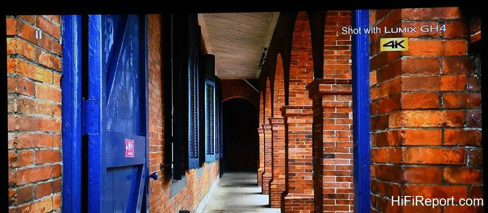
This explains why, while resolution is important, it’s gradually becoming less of the absolute deciding factor.

Color: A Crucial Factor
The other three conditions—color, contrast, and gradation—also significantly influence the image quality, and their impact doesn’t change with viewing distance. Let’s start with the most crucial: color. Color plays a pivotal role in how pleasing a picture is. Whether a rose in the image is vividly red, or a baby’s skin looks naturally rosy and tender, is conveyed through color, not resolution.

I personally believe that for resolutions at Full HD and above, the importance of color is absolutely on par with resolution. For example, imagine a red apple on screen. If the resolution is very high (details are intricate), but the red color isn’t sufficiently vibrant or rich, lacking that appealing, tempting hue, it’s still unappealing and doesn’t fully satisfy the eye.

The process of color reproduction in a projector is actually quite complex, involving at least color gamut, color depth, and more. Let’s first discuss color gamut, which is the easiest to understand. Color gamut refers to “the range of colors a projector can display,” essentially its color rendering capability. A projector with a wide color gamut can display richer, deeper colors. A projector with a small color gamut will produce colors that appear washed out, less saturated, and less vibrant.
A clear example is a red sports car in sunlight. Observed with the naked eye in natural light, that red is incredibly vivid. A projector with an insufficient color gamut simply cannot reproduce that intensely impactful, vibrant red.
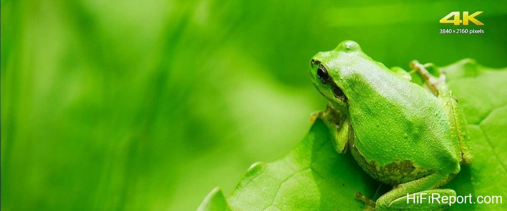
Visualizing Color Gamut
To measure and represent a projector’s color gamut, we often use the CIE color space diagram, sometimes called the horseshoe or bell shape diagram. This diagram represents the entire range of colors visible to the human eye in the natural world. As of today, no projector can display all the colors visible to the human eye; they can only render a portion. Display devices almost exclusively produce colors using combinations of red, green, and blue (R, G, B).
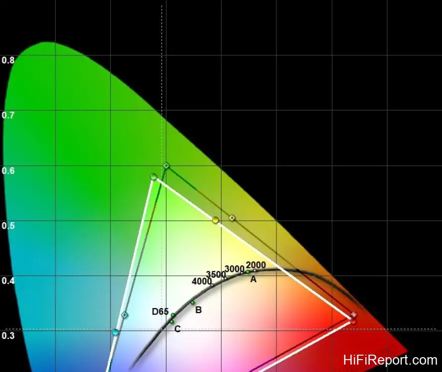
Therefore, we plot the coordinates of the deepest R, G, and B colors that a projector can display, connect them with lines, and the resulting triangle represents the projector’s color gamut. A larger color gamut means a greater ability to display deep, rich, and vibrant effects.

Of course, color performance is also related to color depth, color temperature, color accuracy, and color brightness, but a wider color gamut at least provides greater flexibility in color expression, particularly in displaying the most vibrant hues.

The Significance of Contrast
Contrast refers to “the ratio between the brightest and darkest points in an image.” Naturally, a higher number is better, indicating either brighter whites or deeper blacks. Let’s examine the problematic situations that arise when resolution is sufficient but contrast is lacking. If a projector cannot render sufficiently dark areas, a night scene on screen will look grayish and lifted, lacking depth and impact. Such a night view has no charm.

If you happen to be watching a horror movie, the atmosphere will be significantly compromised. In this scenario, even if the resolution is very high and objects are sharp, the emotional impact of the viewing experience will be diminished. Alternatively, if a projector cannot render sufficiently bright areas, scenes like a sunrise will lack dazzling sunlight, again detracting from the intended feeling.
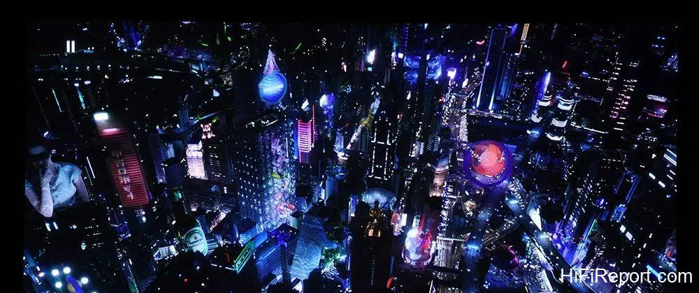
This is why many modern projectors emphasize higher brightness (light output) or support HDR (High Dynamic Range); both aim to provide viewers with better light and dark contrast effects. Therefore, when selecting a projector, it is essential to pay attention to specifications related to contrast.

Gradation Explained
Next, let’s look at gradation. Gradation refers to “the number of steps or levels that compose the transition from the darkest to the brightest parts of an image.” Without color, this is called grayscale. When color is introduced, it’s called color gradation or color depth, referring to the number of color steps from the darkest to the brightest color. These are crucial elements contributing to high picture quality.
Imagine a black and white photograph, a close-up of an elderly person’s face full of wrinkles. If the transition from dark to light is composed of rich, detailed grayscale variations, you will perceive the photograph as three-dimensional and even feel a sense of depth within the image. Now, imagine a color photograph of a red apple.
If the color gradation is very fine, with rich and smooth transitions from light red to deep red, you will feel the apple is three-dimensional, natural, and even appetizing. See? Although gradation might not be the most prominently listed specification, it profoundly influences the image’s finesse, dimensionality, and naturalness. It plays a critical role in how realistic and textured a picture appears.
Quantifying Gradation: Color Depth
If you want to observe gradation from specifications, a simpler way is to look at how many bits are used for image display, sometimes referred to as “color depth.” If a display device is specified as 8-bit color, it means each of the RGB primary colors can render 256 steps of gradation (2^8). A 10-bit display means each primary color can render 1024 steps (2^10), which is equivalent to four times the variation of 8-bit.
Since projector images are largely composed of RGB, when combined, a 10-bit image can produce 64 times more color gradation variations than 8-bit (4^R * 4^G * 4^B). This richer and finer color variation leads to better image dimensionality, naturalness, and realism.
How can you observe good or bad gradation in an image? It’s difficult to notice in complex scenes, but it becomes very apparent in large areas of a single color. In images with good gradation, the color transitions are fine, continuous, and natural. The sky is an excellent example. The sky is mostly composed of smooth gradients of similar hues. A projector with poor gradation will fail to render these subtle transitions smoothly, resulting in a “banding” effect, like contour lines.
If you see banding in the sky (or even on someone’s face), the image is flawed. It will also likely feel less three-dimensional and less natural. In such cases, even very high resolution and sharp details are futile.
Conclusion
Looking at all this, you can see whether resolution is important. Of course, it is important, but it is no longer the sole factor determining image quality. If someone tells you “high resolution equals high picture quality” or “when buying a projector, only look at resolution,” these claims are debatable and open to discussion. So, in the future, when selecting a projector, besides resolution, you must simultaneously consider color, contrast, and gradation performance.
Especially regarding color, you should not only look at its gamut and depth but also pay attention to color brightness. If the colors aren’t vibrant or saturated enough, or if the image appears dim or lacks vibrancy when displaying colored scenes, these are shortcomings. Even if the resolution specification is very high, I recommend considering other options.